
Adobe Live is a streaming video series where top creatives share their process. The show features top designers, illustrators and animators and shows how they create their work in real-time.
But as Oddfellows creative director Chris Kelly explains, the show had a problem — it didn’t have a brand.
“Other than using the Adobe typeface there wasn’t much consistency between the shows. The brand was kind of nebulous.”
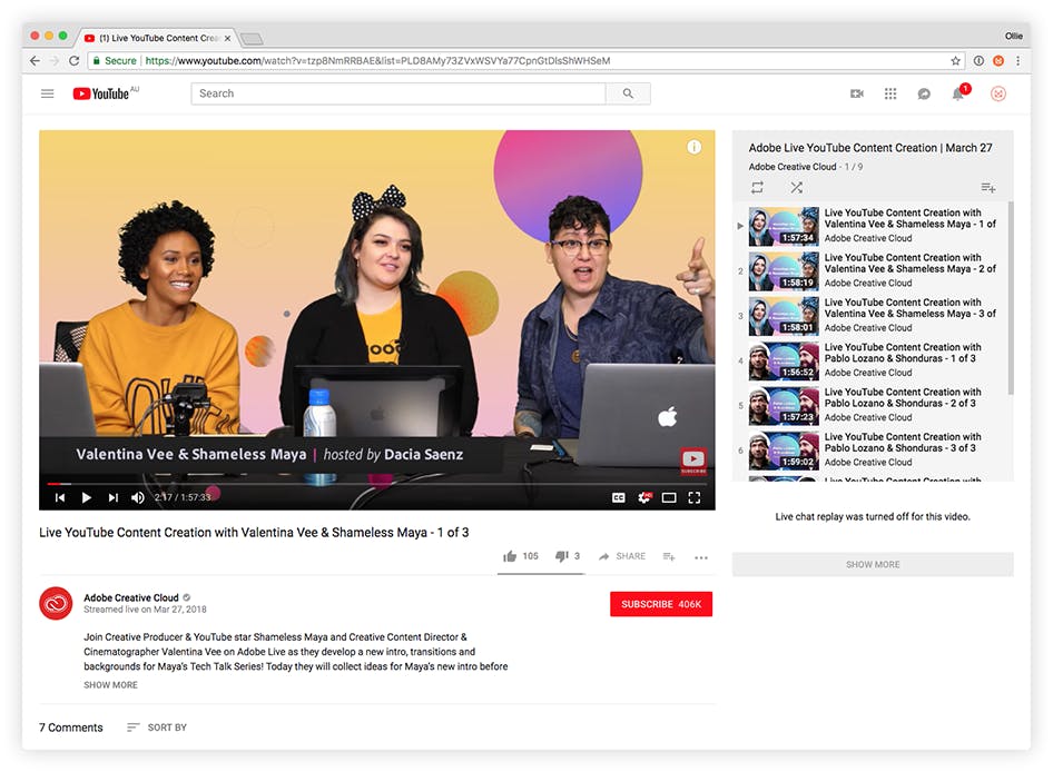
Adobe Live on Youtube.
Oddfellows were tasked with creating a visual identity for the show. Their first challenge was finding a way to represent all of the different creative professions that would be featured as guests.
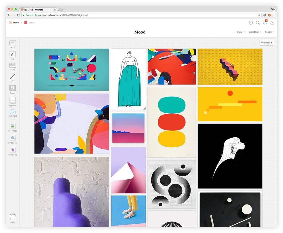
Illustration, Sarah Beth Morgan.
“Initially we wanted to represent the range of creatives abstractly, using a system of funky building blocks. The blocks were to act like tiny micro-machines that would arrange themselves into creative tools — a camera to represent photography or pencil for illustration. While this system worked for familiar fields like illustration and photography it was limiting and didn’t work as well to visualize the wide range of guests that appear on the show. Professions like UX designer or digital painter didn’t read clearly when abstracted.”
Chris’s realisation that the system needed to work for a more diverse range of professions started to led the team down a new path.
“We asked ourselves ‘what if we string all these different styles together and just be very true to each of the fields we are trying to represent?’ And we’ll use color and form to bring everything together. This is one of the first few moodboards where we really started to develop what this could be.”
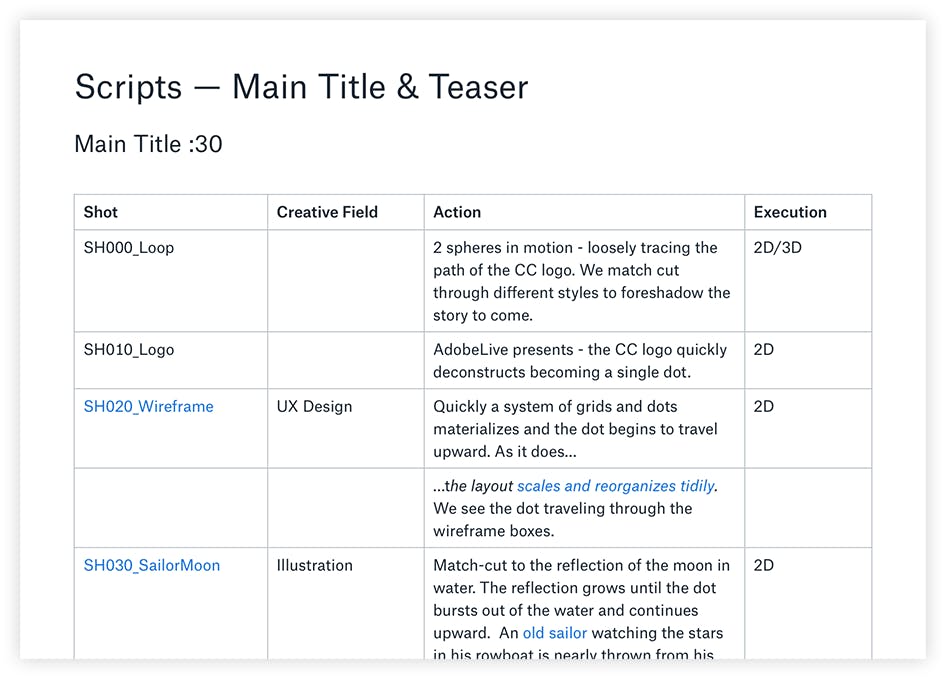
Working from this seed of an idea, Chris started to map out the shots that would make up the title sequence of the show.
“We created a written list of the different shots. I like to start with words before moving on to sketches. Storyboards move quickly if you come with a story ready to draw. A sketch that needs a story is just one more problem to solve.”
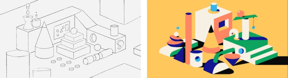
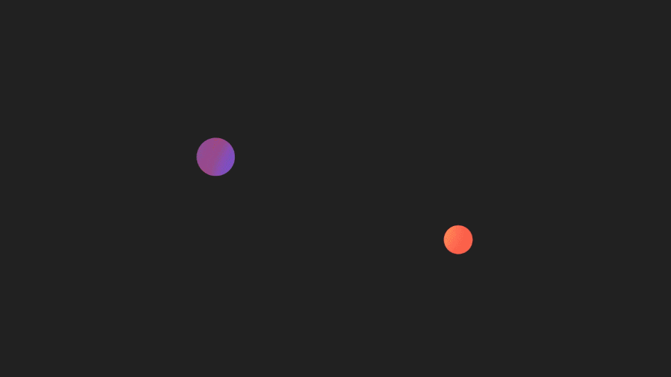
Working from the shot list, the team at Oddfellows began to sketch out a sequence of scenes to represent the different creative disciplines. They would be in very different styles, but linked together by color and a common object — the sphere.
![]()
“This sphere was born of the Creative Cloud logo. It became the central object that we used to transition from scene to scene. Ultimately the piece would end with all the spheres gravitating together like planets in some kind of creative galaxy.”

Left: Rough sketches. Right: Final frames in the title sequence.
The sphere concept carried through to all the parts of the brand, like this scene in the title sequence representing the UX design process.
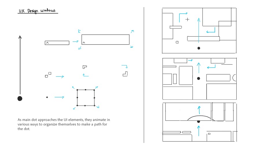
The original storyboard for the UX scene.
“The thought behind this scene was to start out really chaotic and unorganized but as the sphere reaches the top everything is aligned and working together in unison. Eventually the pieces come together to become a functional thing … the same way a UX designer might go from a wireframe to a mockup to a working prototype.”
The final UX design animation.
“Because this would be the opening shot we designed it to feel like the start of something. The scene itself represents screen design but it also speaks to process and that spans all disciplines.”
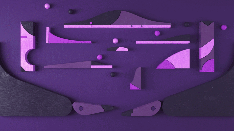
Some creative disciplines were represented in more abstract ways, like this scene where the sphere became a pinball representing motion graphics.
An initial motion study for the pinball scene.
“We wanted to infuse some subtle humor and a sense of frustration in the animation — the player whacking away these balls but missing again and again.”
The colours for each scene were chosen to match relevant Abobe products — in this case the purple icon from After Effects.

2D styleframe, Yuki Yamada.
“This would have been a nice shot if it had stayed a flat, 2D illustration but ultimately we wanted this moment to feel physical and tactile — like something you could interact and play with.”
Final 3D shot, Chris Guyot.
“We used familiar objects as reference. Here we’re referencing the wooden blocks or toys you might have played with as a child. The scene is not necessarily photo-real but it feels real enough. The key to making it feel photographic is the way you light and texture the scene — the way the light breaks up across the surface of an object.”
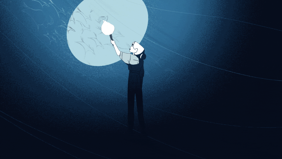
In the final shot of the title sequence, a sphere orbiting around a planet becomes the glow of an explorer’s torch illuminating ancient cave paintings. The style of this scene was chosen to represent digital painting in Photoshop.
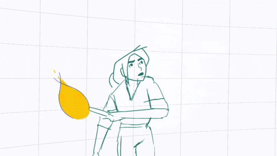
Rough Animation, Josh Parker.
“From really early on I liked this idea of a torch coming out of the darkness to reveal a character. Even when we were writing the script we knew it could be a really cool transition — to shift from a very graphic moment to a very painterly one. I think it’s little surprises like these that really make the piece successful.”
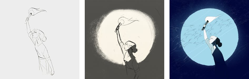
The explorer - from sketch to final design, Manddy Wyckens.
“Even though it’s only two seconds long, we took time to develop a bit of a character and give them a certain time and place … who is she and what is she doing? We were thinking about the history of art itself and how it started with cave painting.”
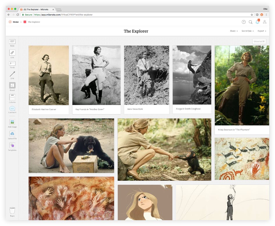
“This was a fun shot to research. These are some female explorers from the 1920s and 30s, Jane Goodall, women mountaineers.”
The final piece of work was a triumph, winning its category in the annual Motion Awards. Take a look below to see the finished title sequence for the show.


